Web Design
Course Project
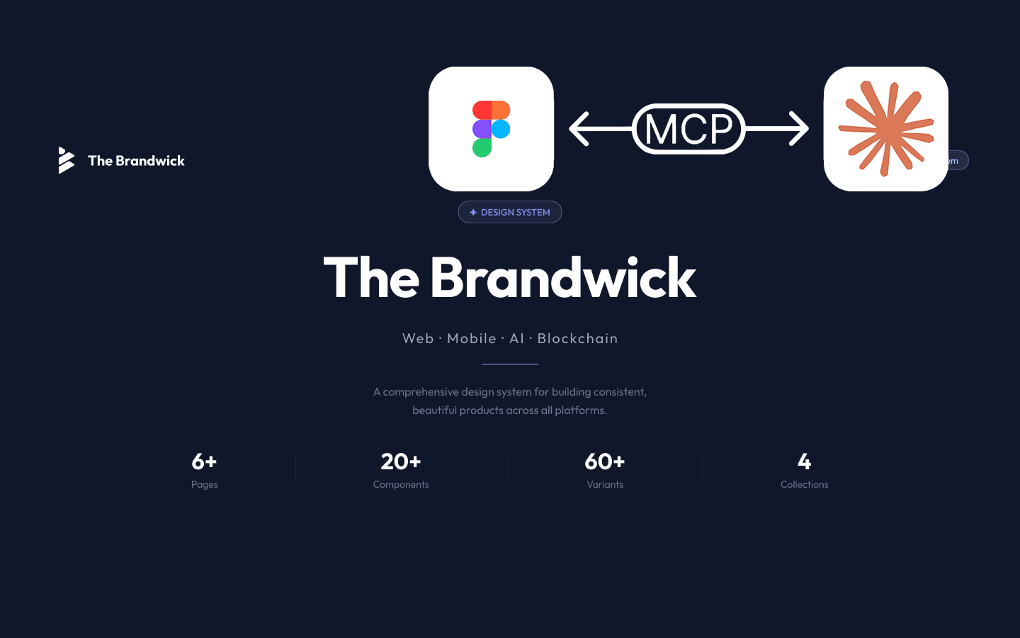
E-Cell Website
Redesigned a student entrepreneurship website to boost engagement, modernize structure, and highlight the community behind the brand.
Year :
2023
Role :
● UX Designer
● UX Researcher
Team :
Only Me!
Skills :
● User research
● Web Architecture
● Prototyping
● Usability Testing
The Problem :
The Entrepreneurship Cell (E-Cell) at IIT Bombay had a strong offline presence, but its website didn’t reflect that energy. The previous site was cluttered, slow, and hard to navigate. It buried important content, lacked visual hierarchy, and didn’t inspire trust for visitors, partners, or prospective applicants.
The goal was clear: turn a clunky brochure site into a fast, credible, and engaging digital presence.

Research & Discovery :
I interviewed five students and alumni involved with E-Cell, mapped key pain points, and benchmarked websites from similar student orgs.
The biggest issues were:
• Cluttered layout with poor readability
• No clear structure or content hierarchy
• Low visibility of key info (events, initiatives, team)
• Broken links and non-functional CTAs
• No footer, no gallery, no mobile optimization
The website wasn’t just a place for info, it was a trust signal for potential collaborators, sponsors, and recruits. A credible, modern site needed to communicate legitimacy in seconds.
Design Priorities :
I focused on building around three core needs:
• Log expenses quickly without getting stuck in a flow
• Understand where money goes in one glance
• Stay motivated without guilt or judgment
before & after :
Area
Before
After
Navigation
Complex, unclear links; no footer
Simplified nav + footer with structured layout |
Readability
Small fonts, poor spacing
Optimized typography and visual hierarchy
Broken Links
|
All links functional; better info flow |
Visual Content
No media or photos
Gallery page with hover zoom + carousel |
Team Transparency
No team presence
Dedicated team profiles with social links


Outcomes :
By the end of the project, the E-Cell website had :
50%
decrease in user frustration after addressing navigation and readability issues.
55%
boost in visual engagement came from creating a Gallery Page showcasing event photos.
30%
more page visits were recorded after introducing a footer for improved navigation.
What I Learned :
I had some reflections by the end of this project :
Structure changes everything
Just adding a footer made the site way easier to explore.
Visual storytelling builds trust
The Gallery Page brought the community to life.
Fixing the small things matters
Broken links were more damaging than we realized, removing that friction improved engagement across the board.
More Projects


Web Design
Course Project
E-Cell Website
Redesigned a student entrepreneurship website to boost engagement, modernize structure, and highlight the community behind the brand.
Year :
2023
Role :
● UX Designer
● UX Researcher
Team :
Only Me!
Skills :
● User research
● Web Architecture
● Prototyping
● Usability Testing
The Problem :
The Entrepreneurship Cell (E-Cell) at IIT Bombay had a strong offline presence, but its website didn’t reflect that energy. The previous site was cluttered, slow, and hard to navigate. It buried important content, lacked visual hierarchy, and didn’t inspire trust for visitors, partners, or prospective applicants.
The goal was clear: turn a clunky brochure site into a fast, credible, and engaging digital presence.
Research & Discovery :
I interviewed five students and alumni involved with E-Cell, mapped key pain points, and benchmarked websites from similar student orgs.
The biggest issues were:
• Cluttered layout with poor readability
• No clear structure or content hierarchy
• Low visibility of key info (events, initiatives, team)
• Broken links and non-functional CTAs
• No footer, no gallery, no mobile optimization
The website wasn’t just a place for info, it was a trust signal for potential collaborators, sponsors, and recruits. A credible, modern site needed to communicate legitimacy in seconds.
Design Priorities :
I focused on building around three core needs:
• Log expenses quickly without getting stuck in a flow
• Understand where money goes in one glance
• Stay motivated without guilt or judgment
before & after :
Area
Before
After
Navigation
Complex, unclear links; no footer
Simplified nav + footer with structured layout |
Readability
Small fonts, poor spacing
Optimized typography and visual hierarchy
Broken Links
|
All links functional; better info flow |
Visual Content
No media or photos
Gallery page with hover zoom + carousel |
Team Transparency
No team presence
Dedicated team profiles with social links
Outcomes :
By the end of the project, the E-Cell website had :
50%
decrease in user frustration after addressing navigation and readability issues.
55%
boost in visual engagement came from creating a Gallery Page showcasing event photos.
30%
more page visits were recorded after introducing a footer for improved navigation.
What I Learned :
I had some reflections by the end of this project :
Structure changes everything
Just adding a footer made the site way easier to explore.
Visual storytelling builds trust
The Gallery Page brought the community to life.
Fixing the small things matters
Broken links were more damaging than we realized, removing that friction improved engagement across the board.
More Projects
Web Design
Course Project
E-Cell Website
Redesigned a student entrepreneurship website to boost engagement, modernize structure, and highlight the community behind the brand.
Year :
2023
Role :
● UX Designer
● UX Researcher
Team :
Only Me!
Skills :
● User research
● Web Architecture
● Prototyping
● Usability Testing
The Problem :
The Entrepreneurship Cell (E-Cell) at IIT Bombay had a strong offline presence, but its website didn’t reflect that energy. The previous site was cluttered, slow, and hard to navigate. It buried important content, lacked visual hierarchy, and didn’t inspire trust for visitors, partners, or prospective applicants.
The goal was clear: turn a clunky brochure site into a fast, credible, and engaging digital presence.
Research & Discovery :
I interviewed five students and alumni involved with E-Cell, mapped key pain points, and benchmarked websites from similar student orgs.
The biggest issues were:
• Cluttered layout with poor readability
• No clear structure or content hierarchy
• Low visibility of key info (events, initiatives, team)
• Broken links and non-functional CTAs
• No footer, no gallery, no mobile optimization
The website wasn’t just a place for info, it was a trust signal for potential collaborators, sponsors, and recruits. A credible, modern site needed to communicate legitimacy in seconds.
Design Priorities :
I focused on building around three core needs:
• Log expenses quickly without getting stuck in a flow
• Understand where money goes in one glance
• Stay motivated without guilt or judgment
before & after :
Area
Before
After
Navigation
Complex, unclear links; no footer
Simplified nav + footer with structured layout |
Readability
Small fonts, poor spacing
Optimized typography and visual hierarchy
Broken Links
|
All links functional; better info flow |
Visual Content
No media or photos
Gallery page with hover zoom + carousel |
Team Transparency
No team presence
Dedicated team profiles with social links
Outcomes :
By the end of the project, the E-Cell website had :
50%
decrease in user frustration after addressing navigation and readability issues.
55%
boost in visual engagement came from creating a Gallery Page showcasing event photos.
30%
more page visits were recorded after introducing a footer for improved navigation.
What I Learned :
I had some reflections by the end of this project :
Structure changes everything
Just adding a footer made the site way easier to explore.
Visual storytelling builds trust
The Gallery Page brought the community to life.
Fixing the small things matters
Broken links were more damaging than we realized, removing that friction improved engagement across the board.