App Design
Web Development
Personal Project
FlexiFly
Inspired by my own travel frustrations, I designed a flight booking app that lets users search within date ranges to find the best deals. A streamlined UI and visual pricing calendar reduced booking time by 40%.
Year :
2024 - 2025
Role :
● UX Designer
● Web Developer
Team :
Only me!
Skills :
● Product Strategy
● UX Research
● Web Development
● Prototyping
The Problem :
As an international student flying between India and the U.S., I was constantly juggling open-ended travel plans, holidays, internships, semester breaks. The problem? Most flight booking tools weren’t built for flexibility.
They forced me to enter exact dates even when I didn’t know them. Searching for affordable flights meant running dozens of date combinations manually, copying results into spreadsheets, and trying to spot patterns.
It was tedious, time-consuming, and honestly kind of broken. So I decided to design a better way.

The Idea :
What if flight search started with your flexibility, not your fixed plans?
I imagined a tool where you could enter a range of departure dates and a range of return dates, and instantly see the best trip combinations, with prices and trip lengths visible in one view.
That became the core interaction that drove every design decision in FlexiFly.
I designed FlexiFly to rethink flight search around flexibility, visibility, and control.


Research :
I interviewed 7 budget-conscious travelers, mostly international students like me. Every one of them had the same pain: they had flexibility but no way to use it effectively.
Some used Google Flights’ calendar view, others manually checked different combos. Most gave up after a few searches. They were either overwhelmed or just didn’t trust the system to show them the best option.
After further understanding users needs through interviews and what will make this product stand out from its competitors, I set the following success metrics: Deal Discovery, Booking Process, and Price related feature engagement.
So, I mapped out what a flexible flight search should actually do:
• Let users explore a wide range of dates
• Make price trends obvious, not buried
• Show trip length up front (because 5 days vs. 11 days matters)
Testing & Iteration :
I tested FlexiFly with students planning winter break trips to evaluate how easily they could discover the best flight deals within flexible dates. Each testing round revealed key usability gaps and drove measurable improvements.
Version 1 :
Version 1 :
In the first round, I tested the range selector and Flexible Dates checkbox to validate the concept. Testers liked the flexibility but found it unclear how the feature worked, it still felt like a regular booking tool.
Fix: Refined the range selector visuals, and highlighted selected ranges to make flexibility more intuitive.

Version 2 :
Version 2 :
In the next round, I added the date grid, an interactive matrix that mapped departure and return combinations. Each cell displayed price and trip duration, with cheaper trips highlighted in green.
Feedback: Users loved the visual approach, it helped them spot patterns instantly. But they still wanted control over how results were displayed.
Fix: I refined the grid legend for better readability and adjusted color contrast to make patterns pop more clearly.

Version 3 :
Version 3 :
The final tests focused on refinement. Users asked for ways to narrow results by how long they could be away and to balance price with convenience.
Fix: I added trip length filters (e.g., 5–10 days) and a Best Price / Best Time toggle to let users prioritize what mattered most. I also introduced a mobile-friendly drag-to-select date picker for easier range input.

Version 4 :
Version 4 :
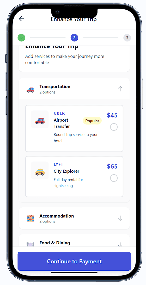
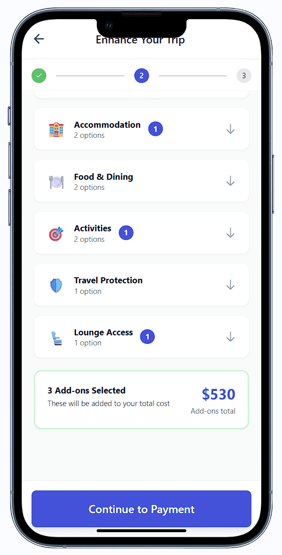
In this iteration, I explored how FlexiFly could turn checkout into a high-intent moment by introducing relevant add-ons without disrupting the core flight purchase.
Add-ons appear within a 3-step checkout flow, surfaced only at natural decision points. Each offer is embedded natively, presented with a brand logo, a short value-focused description, and a starting or estimated price. In a real implementation, offers would link directly to brand websites to reinforce trust.
High-Intent Moment
FlexiFly treats checkout as a high-intent moment. Add-ons appear only after users commit to a flight, keeping the core purchase uninterrupted while intent is strongest.
Frictionless Selection
Users can add offers with a single click. Selections are captured instantly and reflected in a live, itemized total, reinforcing value without slowing down checkout.
Native, Contextual Offers
Add-ons are embedded directly into the checkout flow as native cards. Each includes a recognizable brand logo, a clear value statement, and a starting or estimated price to set expectations early.
Add-ons are embedded directly into the checkout flow as native cards. Each includes a recognizable brand logo, a clear value statement, and a starting or estimated price to set expectations early.
Built for Scale (Concept Demo)
In a real implementation, offers would link to brand websites and finalize pricing at checkout. This model shows how relevant, contextual offers can scale into a revenue layer without compromising user trust.
This concept shows how timely, contextual offers can add value for users while creating a scalable revenue opportunity for the platform.
Prototyping :
I started in Figma with low-fidelity wireframes, then built up a system around three key design pillars:
Flexible search flows :
Users select flexible departure and return date windows. FlexiFly then analyzes all viable combinations, like Oct 10–12 out, Oct 18–20 back, and surfaces the cheapest options with trip durations calculated.
Color-Coded Grid View :
An interactive grid visualizes every possible trip combo. Each cell shows price and trip length. Cheaper trips appear in green, making standout options easy to spot in seconds.
Smart Filtering and Suggestions:
Users can filter by trip length, toggle between “Best Price” and “Best Time,” and get suggestions for nearby airports or cheaper date shifts.
Key Insight: People don’t mind flexibility, but they need tools that help them see the tradeoffs. Price, time, and trip duration should be surfaced, not buried.
The Build :
To prototype the frontend, I used generative AI tools like Replit and Claude to build interactive components and logic for the date grid. This cut my development time by 35%, letting me test and refine designs faster.
Two ways to book :
Outcomes :
By the end of the semester, FlexiFly had :
65%
improvement in flight deal discovery resulted from introducing flexible date range selection.
40%
faster booking process was achieved through optimized search and filtering experiences.
35%
Users found the cheapest flights without using multiple different platforms
What I Learned :
I had some reflections by the end of this project :
Designing for uncertainty creates real user value, if you surface the right signals
Visual thinking (grids, colors, durations) beats filters and dropdowns
The best UX sometimes comes from rethinking defaults, not adding more features
More Projects


App Design
Web Development
Personal Project
FlexiFly
Inspired by my own travel frustrations, I designed a flight booking app that lets users search within date ranges to find the best deals. A streamlined UI and visual pricing calendar reduced booking time by 40%.
Year :
2024 - 2025
Role :
● UX Designer
● Web Developer
Team :
Only me!
Skills :
● Product Strategy
● UX Research
● Web Development
● Prototyping
The Problem :
As an international student flying between India and the U.S., I was constantly juggling open-ended travel plans, holidays, internships, semester breaks. The problem? Most flight booking tools weren’t built for flexibility.
They forced me to enter exact dates even when I didn’t know them. Searching for affordable flights meant running dozens of date combinations manually, copying results into spreadsheets, and trying to spot patterns.
It was tedious, time-consuming, and honestly kind of broken. So I decided to design a better way.
The Idea :
What if flight search started with your flexibility, not your fixed plans?
I imagined a tool where you could enter a range of departure dates and a range of return dates, and instantly see the best trip combinations, with prices and trip lengths visible in one view.
That became the core interaction that drove every design decision in FlexiFly.
I designed FlexiFly to rethink flight search around flexibility, visibility, and control.
Research :
I interviewed 7 budget-conscious travelers, mostly international students like me. Every one of them had the same pain: they had flexibility but no way to use it effectively.
Some used Google Flights’ calendar view, others manually checked different combos. Most gave up after a few searches. They were either overwhelmed or just didn’t trust the system to show them the best option.
After further understanding users needs through interviews and what will make this product stand out from its competitors, I set the following success metrics: Deal Discovery, Booking Process, and Price related feature engagement.
So, I mapped out what a flexible flight search should actually do:
• Let users explore a wide range of dates
• Make price trends obvious, not buried
• Show trip length up front (because 5 days vs. 11 days matters)
Testing & Iteration :
I tested FlexiFly with students planning winter break trips to evaluate how easily they could discover the best flight deals within flexible dates. Each testing round revealed key usability gaps and drove measurable improvements.
Version 1 :
Version 1 :
In the first round, I tested the range selector and Flexible Dates checkbox to validate the concept. Testers liked the flexibility but found it unclear how the feature worked, it still felt like a regular booking tool.
Fix: Refined the range selector visuals, and highlighted selected ranges to make flexibility more intuitive.
Version 2 :
Version 2 :
In the next round, I added the date grid, an interactive matrix that mapped departure and return combinations. Each cell displayed price and trip duration, with cheaper trips highlighted in green.
Feedback: Users loved the visual approach, it helped them spot patterns instantly. But they still wanted control over how results were displayed.
Fix: I refined the grid legend for better readability and adjusted color contrast to make patterns pop more clearly.
Version 3 :
Version 3 :
The final tests focused on refinement. Users asked for ways to narrow results by how long they could be away and to balance price with convenience.
Fix: I added trip length filters (e.g., 5–10 days) and a Best Price / Best Time toggle to let users prioritize what mattered most. I also introduced a mobile-friendly drag-to-select date picker for easier range input.
Version 4 :
Version 4 :
In this iteration, I explored how FlexiFly could turn checkout into a high-intent moment by introducing relevant add-ons without disrupting the core flight purchase.
Add-ons appear within a 3-step checkout flow, surfaced only at natural decision points. Each offer is embedded natively, presented with a brand logo, a short value-focused description, and a starting or estimated price. In a real implementation, offers would link directly to brand websites to reinforce trust.
High-Intent Moment
FlexiFly treats checkout as a high-intent moment. Add-ons appear only after users commit to a flight, keeping the core purchase uninterrupted while intent is strongest.
Frictionless Selection
Users can add offers with a single click. Selections are captured instantly and reflected in a live, itemized total, reinforcing value without slowing down checkout.
Native, Contextual Offers
Add-ons are embedded directly into the checkout flow as native cards. Each includes a recognizable brand logo, a clear value statement, and a starting or estimated price to set expectations early.
Add-ons are embedded directly into the checkout flow as native cards. Each includes a recognizable brand logo, a clear value statement, and a starting or estimated price to set expectations early.
Built for Scale (Concept Demo)
In a real implementation, offers would link to brand websites and finalize pricing at checkout. This model shows how relevant, contextual offers can scale into a revenue layer without compromising user trust.
This concept shows how timely, contextual offers can add value for users while creating a scalable revenue opportunity for the platform.
Prototyping :
I started in Figma with low-fidelity wireframes, then built up a system around three key design pillars:
Flexible search flows :
Users select flexible departure and return date windows. FlexiFly then analyzes all viable combinations, like Oct 10–12 out, Oct 18–20 back, and surfaces the cheapest options with trip durations calculated.
Color-Coded Grid View :
An interactive grid visualizes every possible trip combo. Each cell shows price and trip length. Cheaper trips appear in green, making standout options easy to spot in seconds.
Smart Filtering and Suggestions:
Users can filter by trip length, toggle between “Best Price” and “Best Time,” and get suggestions for nearby airports or cheaper date shifts.
Key Insight: People don’t mind flexibility, but they need tools that help them see the tradeoffs. Price, time, and trip duration should be surfaced, not buried.
The Build :
To prototype the frontend, I used generative AI tools like Replit and Claude to build interactive components and logic for the date grid. This cut my development time by 35%, letting me test and refine designs faster.
Two ways to book :
Outcomes :
By the end of the semester, FlexiFly had :
65%
improvement in flight deal discovery resulted from introducing flexible date range selection.
40%
faster booking process was achieved through optimized search and filtering experiences.
35%
Users found the cheapest flights without using multiple different platforms
What I Learned :
I had some reflections by the end of this project :
Designing for uncertainty creates real user value, if you surface the right signals
Visual thinking (grids, colors, durations) beats filters and dropdowns
The best UX sometimes comes from rethinking defaults, not adding more features
More Projects
App Design
Web Development
Personal Project
FlexiFly
Inspired by my own travel frustrations, I designed a flight booking app that lets users search within date ranges to find the best deals. A streamlined UI and visual pricing calendar reduced booking time by 40%.
Year :
2024 - 2025
Role :
● UX Designer
● Web Developer
Team :
Only me!
Skills :
● Product Strategy
● UX Research
● Web Development
● Prototyping
The Problem :
As an international student flying between India and the U.S., I was constantly juggling open-ended travel plans, holidays, internships, semester breaks. The problem? Most flight booking tools weren’t built for flexibility.
They forced me to enter exact dates even when I didn’t know them. Searching for affordable flights meant running dozens of date combinations manually, copying results into spreadsheets, and trying to spot patterns.
It was tedious, time-consuming, and honestly kind of broken. So I decided to design a better way.
The Idea :
What if flight search started with your flexibility, not your fixed plans?
I imagined a tool where you could enter a range of departure dates and a range of return dates, and instantly see the best trip combinations, with prices and trip lengths visible in one view.
That became the core interaction that drove every design decision in FlexiFly.
I designed FlexiFly to rethink flight search around flexibility, visibility, and control.
Research :
I interviewed 7 budget-conscious travelers, mostly international students like me. Every one of them had the same pain: they had flexibility but no way to use it effectively.
Some used Google Flights’ calendar view, others manually checked different combos. Most gave up after a few searches. They were either overwhelmed or just didn’t trust the system to show them the best option.
After further understanding users needs through interviews and what will make this product stand out from its competitors, I set the following success metrics: Deal Discovery, Booking Process, and Price related feature engagement.
So, I mapped out what a flexible flight search should actually do:
• Let users explore a wide range of dates
• Make price trends obvious, not buried
• Show trip length up front (because 5 days vs. 11 days matters)
Testing & Iteration :
I tested FlexiFly with students planning winter break trips to evaluate how easily they could discover the best flight deals within flexible dates. Each testing round revealed key usability gaps and drove measurable improvements.
Version 1 :
Version 1 :
In the first round, I tested the range selector and Flexible Dates checkbox to validate the concept. Testers liked the flexibility but found it unclear how the feature worked, it still felt like a regular booking tool.
Fix: Refined the range selector visuals, and highlighted selected ranges to make flexibility more intuitive.
Version 2 :
Version 2 :
In the next round, I added the date grid, an interactive matrix that mapped departure and return combinations. Each cell displayed price and trip duration, with cheaper trips highlighted in green.
Feedback: Users loved the visual approach, it helped them spot patterns instantly. But they still wanted control over how results were displayed.
Fix: I refined the grid legend for better readability and adjusted color contrast to make patterns pop more clearly.
Version 3 :
Version 3 :
The final tests focused on refinement. Users asked for ways to narrow results by how long they could be away and to balance price with convenience.
Fix: I added trip length filters (e.g., 5–10 days) and a Best Price / Best Time toggle to let users prioritize what mattered most. I also introduced a mobile-friendly drag-to-select date picker for easier range input.
Version 4 :
Version 4 :
In this iteration, I explored how FlexiFly could turn checkout into a high-intent moment by introducing relevant add-ons without disrupting the core flight purchase.
Add-ons appear within a 3-step checkout flow, surfaced only at natural decision points. Each offer is embedded natively, presented with a brand logo, a short value-focused description, and a starting or estimated price. In a real implementation, offers would link directly to brand websites to reinforce trust.
High-Intent Moment
FlexiFly treats checkout as a high-intent moment. Add-ons appear only after users commit to a flight, keeping the core purchase uninterrupted while intent is strongest.
Frictionless Selection
Users can add offers with a single click. Selections are captured instantly and reflected in a live, itemized total, reinforcing value without slowing down checkout.
Native, Contextual Offers
Add-ons are embedded directly into the checkout flow as native cards. Each includes a recognizable brand logo, a clear value statement, and a starting or estimated price to set expectations early.
Add-ons are embedded directly into the checkout flow as native cards. Each includes a recognizable brand logo, a clear value statement, and a starting or estimated price to set expectations early.
Built for Scale (Concept Demo)
In a real implementation, offers would link to brand websites and finalize pricing at checkout. This model shows how relevant, contextual offers can scale into a revenue layer without compromising user trust.
This concept shows how timely, contextual offers can add value for users while creating a scalable revenue opportunity for the platform.
Prototyping :
I started in Figma with low-fidelity wireframes, then built up a system around three key design pillars:
Flexible search flows :
Users select flexible departure and return date windows. FlexiFly then analyzes all viable combinations, like Oct 10–12 out, Oct 18–20 back, and surfaces the cheapest options with trip durations calculated.
Color-Coded Grid View :
An interactive grid visualizes every possible trip combo. Each cell shows price and trip length. Cheaper trips appear in green, making standout options easy to spot in seconds.
Smart Filtering and Suggestions:
Users can filter by trip length, toggle between “Best Price” and “Best Time,” and get suggestions for nearby airports or cheaper date shifts.
Key Insight: People don’t mind flexibility, but they need tools that help them see the tradeoffs. Price, time, and trip duration should be surfaced, not buried.
The Build :
To prototype the frontend, I used generative AI tools like Replit and Claude to build interactive components and logic for the date grid. This cut my development time by 35%, letting me test and refine designs faster.
Two ways to book :
Outcomes :
By the end of the semester, FlexiFly had :
65%
improvement in flight deal discovery resulted from introducing flexible date range selection.
40%
faster booking process was achieved through optimized search and filtering experiences.
35%
Users found the cheapest flights without using multiple different platforms
What I Learned :
I had some reflections by the end of this project :
Designing for uncertainty creates real user value, if you surface the right signals
Visual thinking (grids, colors, durations) beats filters and dropdowns
The best UX sometimes comes from rethinking defaults, not adding more features